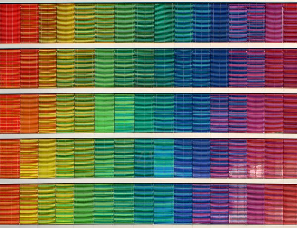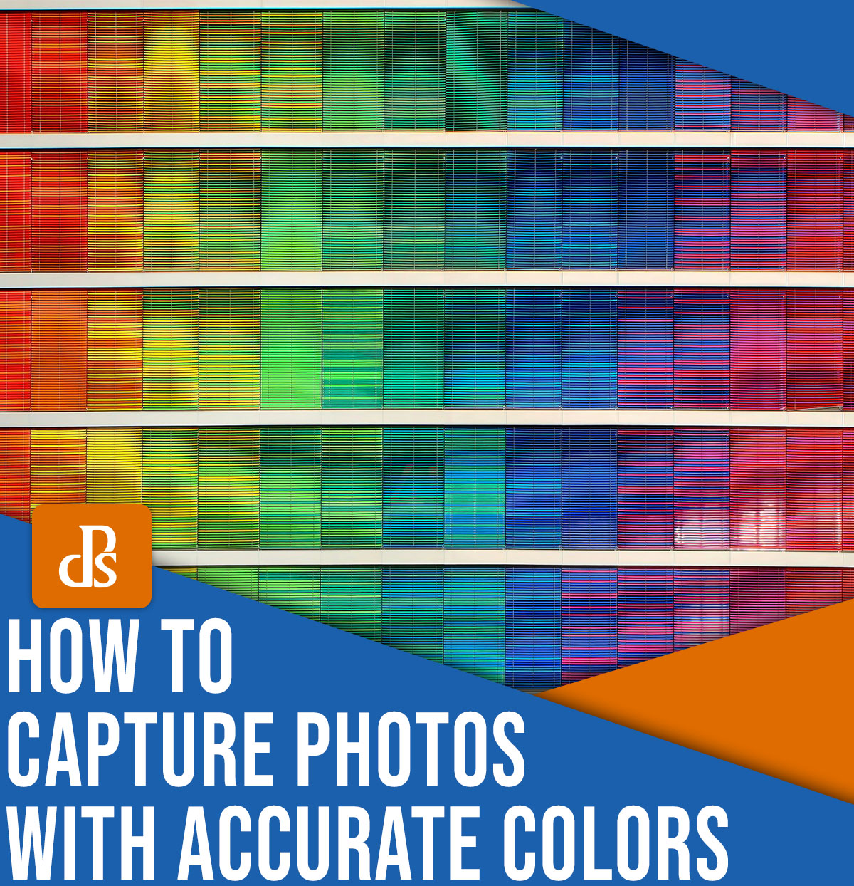
Color accuracy doesn’t get nearly as much as other photography fundamentals – light, composition, and settings, to name just a few – but it’s an essential part of the image-making process, from the initial capture to the final print.
For many photographers, creating color-accurate images involves maintaining colors that match the scene as it looks in real life. But color accuracy is broader than that. Yes, understanding color accuracy will ensure that you can translate the colors that you see into your files and prints, but it’s also just about keeping colors consistent as you move your images through a workflow. Even if you like to apply wild color grades to your photos, you should still ensure that the files on-screen look the same to you as they do to the average viewer and that any resulting prints match your creative intentions.
So without further ado, here are some things you can do to ensure that the colors of your photos remain accurate!
1. Photograph in RAW


This really is key, and I am a huge proponent of photographing in RAW 100% of the time. The colors can be easily adjusted on RAW files in editing software like Lightroom, Photoshop, and others. But with JPEGs, the colors are more “baked in,” so to speak. It is not impossible to adjust the colors to match your creative vision, but it’s harder to achieve the exact match.
In RAW files, all the original image data is preserved. In fact, when RAW files are opened in post-production software like Lightroom, a virtual copy is made and used. Edits are made in a non-destructive format so the original RAW file is always available for changes at a later stage. This is very useful when you want to edit images in different ways at different times in your photographic career.
Since a JPEG image is essentially a RAW image processed and compressed in-camera, the camera’s computer makes decisions on how to edit the file, what data to retain, and what data to toss out when performing the compression operation. As a result, JPEG files tend to have a smaller dynamic range, which often means less ability to preserve both highlights and shadow details in the image. Relatedly, JPEG files have less color information than RAW files, so if you tweak the colors heavily, you can end up with artifacts such as banding.
2. Use the Kelvin White Balance mode on your camera
As I said in the previous tip, I am a huge advocate of RAW photography.
However, RAW files do come with disadvantages: they’re large, they require processing before you can share or display them, and they require more camera-processing power. So if photographing RAW is not something you wish to do or you don’t have space on your hard drives, try photographing using the Kelvin White Balance mode instead of Auto White Balance.
Not all cameras may have this function, so check your camera manual to figure out the exact menu option and also how to adjust the value. Kelvin lets you adjust the white balance in-camera rather than during post-processing. Of course, most cameras also offer white balance presets (e.g., Shade, Cloudy, Incandescent), but the Kelvin mode allows for far more precision when balancing colors.
In general, you’ll find the ranges of Kelvin values for the various lighting setups in your camera manual, but you’ll need to tweak the values depending on your style and how you want the final image to look.
3. Use a good display screen/monitor
Cheaper screens have smaller color ranges, so the better your screen, the more colors that can be displayed. Your monitor is where you’ll be looking at the photos, so you don’t want your image to be limited in that way.
At a minimum, if you’re editing photos, you need a 99% sRGB screen. 100% Adobe RGB capable screens (which is generally better) are also relatively affordable now.
That said, most media on the web generally uses sRGB format, so sRGB is perfectly adequate. People generally recommend editing in that color space, anyway. (In general, for built-in displays like laptops, most modern Mac screens have really good color accuracy and distribution.)
4. Calibrate your monitor
I’m going to keep this tip short and sweet: If you haven’t calibrated your monitor, you definitely, absolutely should! Not enough people realize how big a difference calibrating your monitor makes.
If your entire computer screen is shifted to purple, then you’ll apply improper edits – so that when you look at your final images in a color-calibrated medium, they’re going to appear green!
There are several color-calibration tools in the market that do a good job like Datacolor Spyder 5 or X-Rite ColorMunki. At the end of the day, they all essentially have the same functionality. Plug in the color sensor, put it against your screen, run the software, and it will automatically install the color profile for you.
5. Edit in a color-neutral workspace
Did you know that where you sit and work can make your photos look different? As funny as it may sound, it’s a fact!
If you have bright warm sunlight flooding your computer screen while editing, your images will look warmer, so the files you ultimately produce will likely look on the cooler side. Your eye automatically compensates for the warmth by gravitating towards cooler tones!
If you have cool indoor lighting flooding your editing room, you’ll end up with the opposite effect: your images will turn out too warm!
Believe it or not, the ideal editing environment is a totally dark room. If you don’t have any lighting, you can’t pollute your computer display with non-neutral colors. I know I cannot edit in a dark room because staring at the screen for too long in that space gives me a headache. If you must edit somewhere with another light source, I encourage you to do your initial color calibration in that room. The Spyder and ColorMunki that I recommended above can both accommodate the ambient light in your environment.

6. Use multiple devices to spot-check color
If you are really doubting your color tones and edits, double-check them on another device. iPhones, for instance, tend to be well-calibrated out of the box – and some phones actually let you apply calibration directly.
Unfortunately, you can’t use the calibrators on most phones, but you can always open your images on your phone to get a sense of how most people are seeing your images. (And if you test an image with multiple devices, that’s even better!)
Keep the colors in your photos looking great!
Most people, including myself, don’t pay too much attention to color accuracy in their photos. The color matching often stops at editing. Sometimes, we even call the resulting color cast a photography style and leave it at that.
But if you really want to understand color and how images can actually look versus relying on a specific style or edit, try one or all these steps. It is actually fairly simple once it clicks!
Now over to you:
What techniques do you use for maintaining accurate colors? Share your thoughts in the comments below!