


It’s always a pleasure working with people who know how to deliver great customer service – FASTDOT – thanks for helping me improve my business!! You even made the web design aspect simple and yet so professional! Brilliant!!
We build beautiful websites that get your business noticed!
Offering you a full range of website designs, eCommerce development and
online digital marketing solutions
20+ Years of experience, successfully creating unique and modern online website projects in Australia and worldwide.
Services + Solutions
Are you ready to take your business to the next level? Look no further than our eCommerce solutions! You will be able to expand your reach and sell your products and services to customers all over the world. With a well-designed website, you’ll be able to provide an enjoyable shopping experience for your customers that will keep them coming back for more. Armed with the latest technology, our front and back-end development teams bring your designs to life. We develop for the NOW and build for the FUTURE.
An effective website design should fulfill its intended function by conveying its particular message whilst simultaneously engaging the visitor. Several factors such as consistency, colors, typography, imagery, simplicity, and functionality contribute to good website design.
When designing a website there are many key factors that will contribute to how it is perceived. A well-designed website can help build trust and guide visitors to take action. Creating a great user experience involves making sure your website design is optimized for usability (form and aesthetics) and how easy is it to use (functionality).
We’re a web design company with deep roots in storytelling. Our award-winning web design team creates custom designs that are human-centered and conversion focused.
Please read more about our web design services here:
Aligning perception with your vision
Demonstrate credibility, professionalism and your values via a comprehensive brand identity
Read more regarding the importance of developing a Social Media Strategy
Branding has never been more expansive, adventurous and agile than it is today.
Every brand has a story to tell. And the more intoxicating the story, the more engagement and loyalty you get from your audience. So our brand tenders help craft a brand story that’s authentic, relevant and unique. One which flows in a way that stirs up emotions and solidifies connections across a myriad of touch-points. Becoming the embodiment of the brand that’s emboldened to endure over time.
Read more about Digital Branding
We create and execute multichannel digital marketing strategies. From SEO and content to paid search and social, we co-create an ideal digital strategy with you to capture and convert your target audience.
Find an overview about our Digital Marketing Services here
Our 3D team of talented digital VFX artists have a wealth of experience working on feature films & commercial. Read more …
Search engine marketing (SEM) is a digital marketing strategy used to increase the visibility of a website in search engine results pages (SERPs).
While the industry term once referred to both organic search activities such as search engine optimization (SEO) and paid, it now refers almost exclusively to paid search advertising.
Search engine marketing is also alternately referred to as paid search or pay per click (PPC).
Read more about SEM and PPC advertising here:
Do you need more traffic to your website? At FASTDOT, we offer comprehensive monthly SEO packages, serving as an all-in-one solution to meet your SEO needs. By investing in our ongoing monthly SEO services, your business gains access to a dedicated account manager who will provide the essential elements required for success.
Read more regarding our Managed SEO Packages
Your digital experience has to be fast, functional and always on. We monitor performance around the clock ensuring 100% uptime and scalability.
With our business web hosting you get enterprise only hardware, based entirely on the latest technologies. As a result you get ultimate reliability and speed,up to over 3x speed improvement compared to other web hosts. Start with the hosting plan you need and move to more powerful solutions as your website grows.
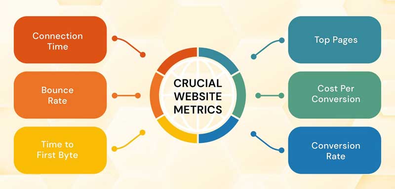
For an in-depth analysis of your websites SEO health we perform a comprehensive website health assessment.
What Is a Website Audit?
The important points of a Website Audit
1. Website Performance Optimisation
Website audits usually evaluate a site not only for its content but also for its technical performance.
As a result, an audit will give you a chance to inspect the robustness of your website’s technical framework and infrastructure. Basically assess how friendly your website is to search engines, and determine how easy it is for users to navigate and intuitively find content on your website.
2. Search Engine Optimisation
By conducting a website audit, We’ll be able to identify any missed SEO opportunities. Consequently this will remedy any misguided or poorly executed SEO pitfalls (e.g. keyword stuffing, exact match anchor text links, etc.) throughout the content of your website.
It will also allow us to re-focus the SEO efforts on users first and search engines second. This will safeguard you from constantly chasing changes to search ranking algorithms, meaning you won’t be applying misguided practices just to show up at the top of the search engine results pages (SERPs).
3. Conversion Rate Optimisation
Website audits also enable us to re-evaluate the effectiveness of your website in terms of lead generation and conversion. As a result, you’ll be able to spot any previously overlooked opportunities to convert visitors into leads. You can add relevant CTAs, as well as identify deficiencies in your landing pages so you can optimise them to boost conversions.
4. Competitive Analysis
Conducting a website audit will allow us to compare your website to your competitor’s. We can analyse how well you’re ranking against competitors for keywords and determine potential new sources of revenue.
We can use external tools, to perform an audit on your competitor’s websites to gather more insights. You can learn how your competitors are attracting visitors and see how they’re garnering conversions.
Ultimately, this will help us formulate new tactics and strategies for your site.
5. Identify Issues
When We do a website audit, you’ll be able to find issues that are hurting your SEO and conversions. Perhaps it’s broken links, hidden content, long page load speed times, or more. Identifying these issues will help repair issues that are diverting traffic.
Assessing both the content and technical aspects of your website will open up opportunities. And afterwards can drastically improve the traffic and conversions your website.
Now that you know what a website audit is and why you should do one, contact us to initiate an audit.
Clients Testimonials

Associated Director
The most competent team that we’ve trusted our company’s website with. Versatile solutions custom made for our particular niche and impressive vision according to our branding campaign. I’d recommend them to any business owner without hesitation.

Entrepreneur
Fastdot are exactly that, fast, and very experienced nothing was a problem and I was up and running within the day. I had support over my social media linking into website and a razor sharp critical eye ensuring everything was optimised and running smoothly. Even though I have a small buisness and big business is their expertise, it was me that benefited from their wisdom and generous insight. Very happy with their service.

Creative Director - Consultant
Karim was fantastic, we got the job done in good time and and he helped me through the whole process patiently, with not only design & content but also with what’s current in terms of peoples expectations when visiting websites

Singer/Songwriter
Get in contact with us
Book a 15 minutes discovery call with one of our digital experts and we will get back to you ASAP.